Hydro Ottawa is one of Ontario’s largest municipally owned electrical utilities, distributing electricity to more than 335,000 residential and commercial customers across Ottawa.
Context
For most customers, Hydro Ottawa’s website isn’t a destination—it’s a tool. Whether paying a bill, checking an outage, moving service, or requesting electrical work, visitors arrive with a specific need and expect to complete it quickly.
As the website approached the end of its lifecycle, Hydro Ottawa saw an opportunity to rethink the customer experience from the ground up. Rather than simply refreshing the interface, the goal was to understand how customers actually used the website and rebuild the experience around their needs.
Challenges
Years of content growth had created a large, complex website serving residential customers, businesses, contractors, developers, and property managers. These audiences often had to navigate the same pathways, making relevant information and essential services harder to find.
The challenge wasn’t simply reducing content. It was determining what customers needed, how they looked for it, and where complexity could be removed without sacrificing critical information. The new website also needed to provide a scalable foundation for long-term content management and brand consistency.
Strategy
Accurate began with a comprehensive content audit and one-on-one customer interviews to understand how people interacted with the website.
The research revealed a consistent pattern: customers weren’t visiting to browse. They wanted to complete a task—pay a bill, check an outage, manage an account—and move on. It also showed that business customers and contractors needed clearer pathways to information created specifically for them.
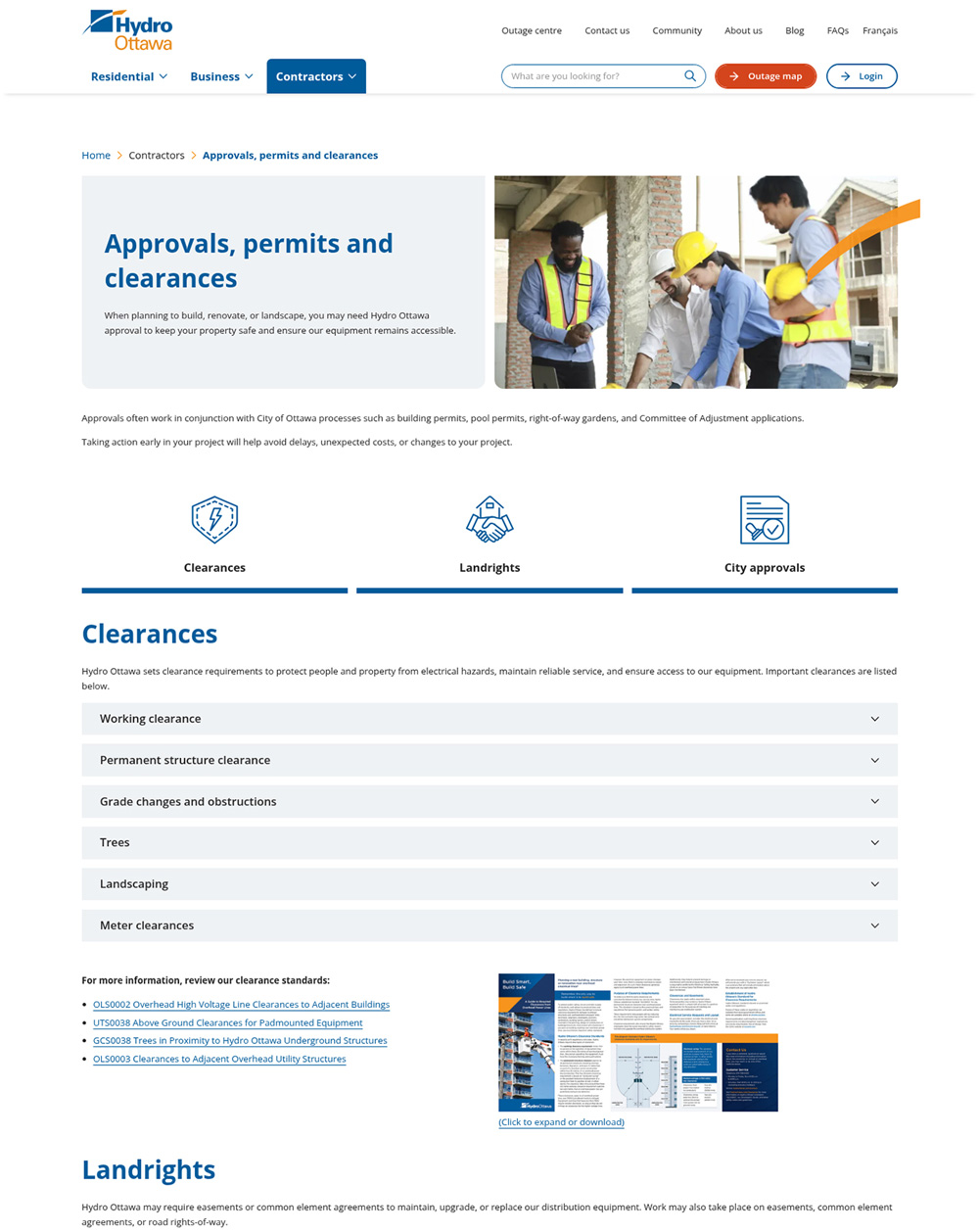
These insights informed an entirely new information architecture centred on audience segmentation, task-based navigation, prominent transactional shortcuts, and simplified content. The subsequent performance data strongly validates that approach: visits to Commercial Support and Incentives increased by 481%, while engagement with content for landlords and property managers rose by 365%.
increase in engagement with landlord and property manager content
+0%
increase in visits to Commercial Support and Incentives content
+0%
Implementation
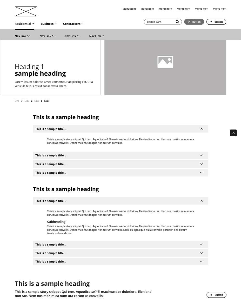
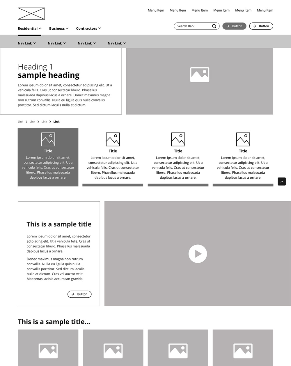
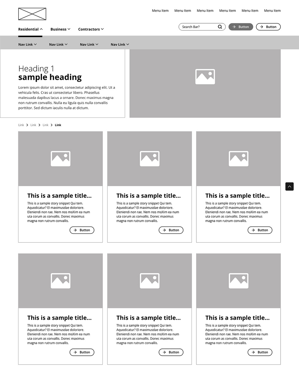
The new architecture, wireframes, and initial content refinements were tested with a representative group of customers before development. Their feedback helped refine the navigation, content structure, and interface around real behaviours rather than internal assumptions.
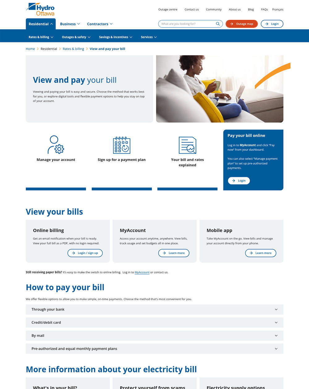
The final website introduced dedicated pathways for residential, business, and contractor audiences; plain-language content; improved search and FAQs; mobile-first layouts; and quick-access icons directing customers to high-demand services. Little additions like adding useful icons at the top of pages made a big—and measurable impact—on user journeys.
The impact of these choices is visible across the customer journey. Visits to Contact Us increased by 89% after it was surfaced through transactional shortcuts and contextual links. Traffic to Your Bill and Rates Explained grew by 84%, while engagement increased by 176%—evidence that customers were not only finding complex information more easily, but actually taking the time to understand it.
Loading phone.glb…
increase in Contact Us visits after adding transactional shortcuts
+0%
increase in traffic to Your Bill and Rates Explained
+0%
increase in engagement
+0%
Results
What began as a user insight evolved into both the website strategy and the campaign that introduced the relaunch. Customers told us they wanted to accomplish a task—not explore a website. That understanding became the guiding principle behind the redesign and inspired the campaign hook, “Get in, get out and get on with your day.” The post-launch metrics demonstrate that the experience lived up to that promise.
Accurate led:
User research and behavioural analysis
Content audit, restructuring, and plain-language content strategy
Information architecture and navigation redesign
UX strategy, wireframing, and prototype validation
UI design and mobile-first experience
Website style guide development
Visual design aligned with Hydro Ottawa’s refreshed brand