Writing for accessibility: clear communication that works for everyone
by Natasha Stewart-Stark
Accessibility isn’t a nice-to-have—it’s a must. And writing with accessibility in mind doesn’t mean watering down your message. It means delivering it in a way that everyone can understand, engage with, and act on. Here’s how to do it right.
1. Keep it clear. Keep it simple.
Complex copy kills comprehension. Strip away fluff, jargon, and passive phrasing so readers grasp your point instantly—and act even faster. The goal: fewer words, greater impact.
When in doubt, simplify.
Use plain language. Cut the jargon and speak like a human.
Keep sentences and paragraphs short and focused.
Write in the active voice.
Use: “Click the button to submit.”
Avoid: “The submission can be initiated by clicking the button.”
2. Use headings that do the heavy lifting
Good design starts with good structure—and that means smart use of headings. Clear, consistent headings make content easier to scan, understand, and navigate—for everyone, including screen readers.
Structure matters.
Use clear, descriptive headings (H1, H2, H3) to break up content.
Follow a logical order—don’t jump from H1 to H3 and skip H2.
3. Make links work harder
Visual cues help those without impairment but descriptive language makes everyone “see” where to go. No one wants to click “here” and guess where they’re going.
Be specific with link text.
Use: “Download the event brochure (PDF)”
Avoid: “Click here to download”
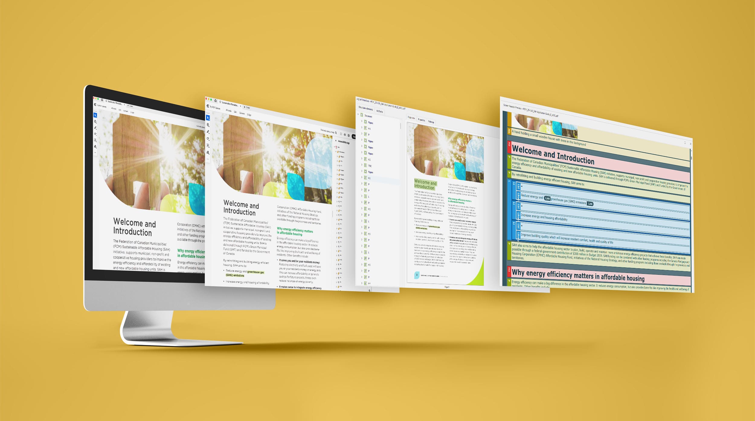
4. Use alt-text effectively
Images that tell a story—alt-text ensures everyone can read it. Not all images should be treated the same. Some tell a story (informative images) while others make that story shine (decorative images).
Informative images:
If the image adds context or value to your content, it needs alt text. Write a short, specific description that captures the image’s purpose.
Want your alt-text to hit the mark? Follow these best practices:
Be brief: keep it under 125 characters.
Be descriptive: say what matters—leave out “image of.”
Stay relevant: consider why the image is there in the first place.
Think function: what role does the image play? Convey that.
Use keywords (when it makes sense): don’t stuff—just be natural.
Mind the grammar: capitalise the first word and end with a period.
Summarise complex images: for charts or graphs, highlight key takeaways.
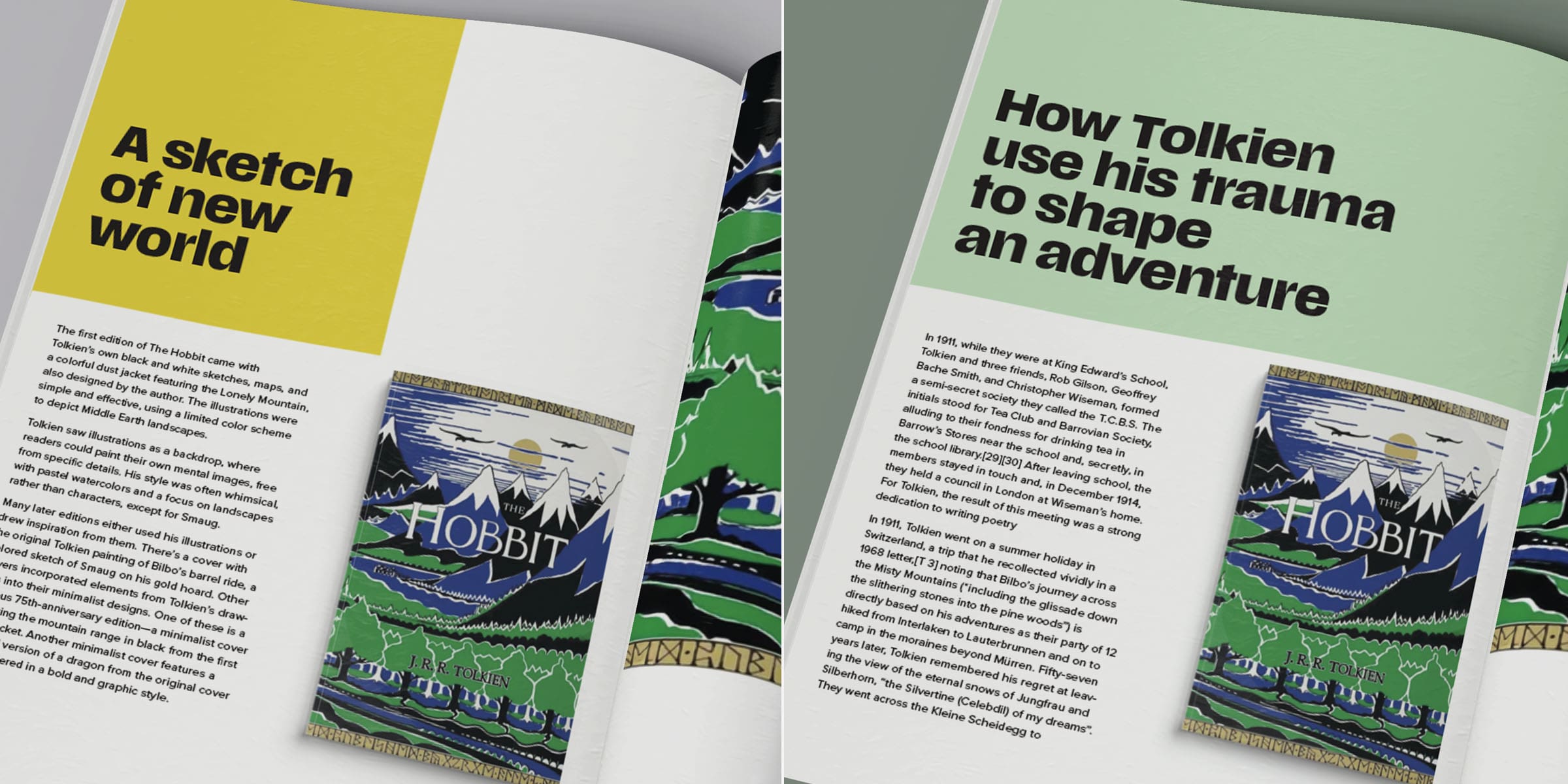
Example:
If you are using this image of “The Hobbit” in an article (on the right) about book design:
Instead of: “Image of a book”
Use: “‘The Hobbit’ first edition cover: stylized Lonely Mountain, bold lines, and a limited colour palette evoke Middle Earth.”
If you are using this image of ‘The Hobbit’, in an article (on the left) about Tolkien’s life use:
Use: “First edition of ‘The Hobbit’, published in 1937, features Tolkien’s own illustration of Middle Earth on the cover.”
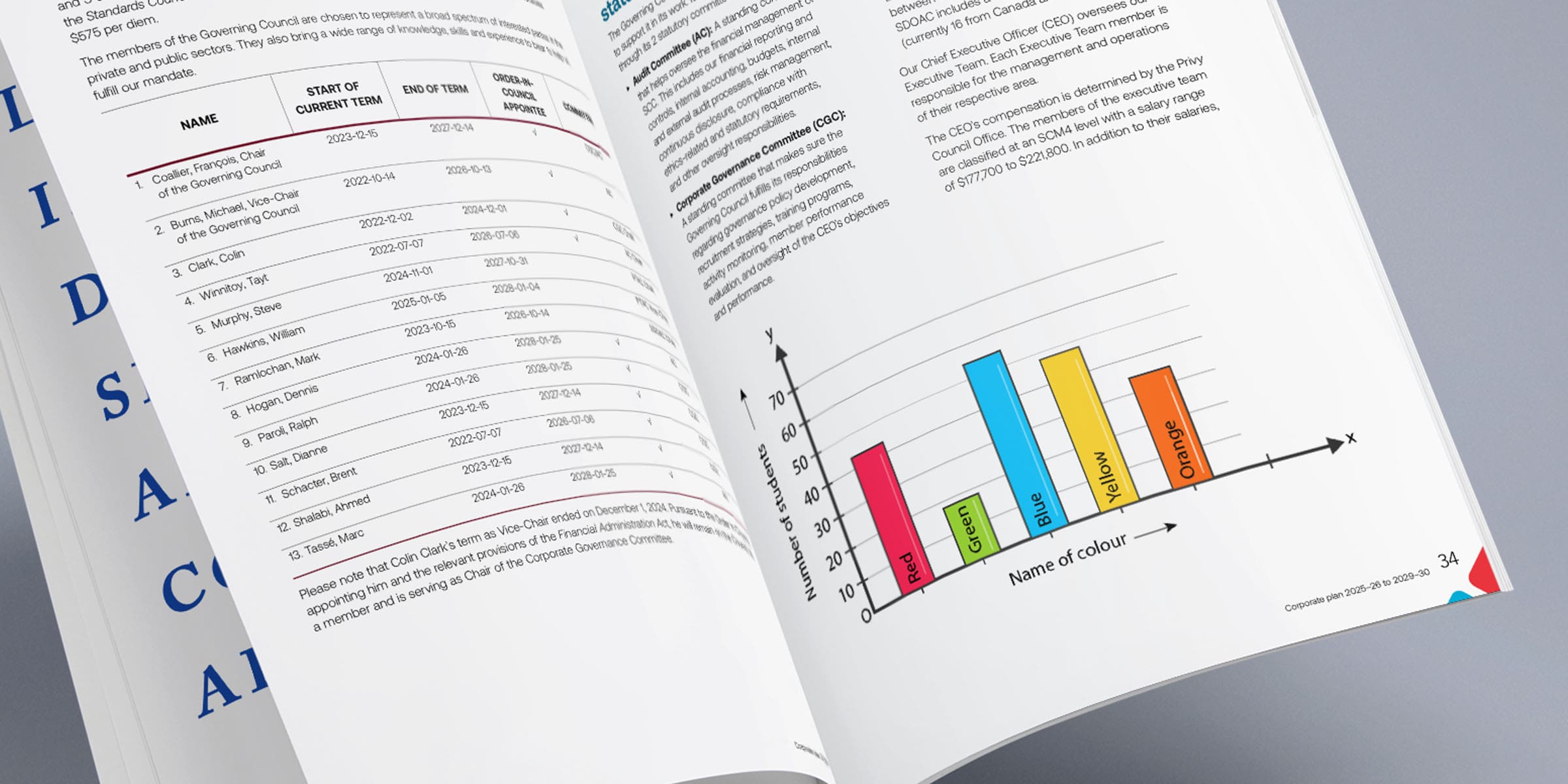
Example (chart):
Instead of: “Picture of a graph”
Use: “Bar chart showing students’ favourite colours: blue leads, followed by green and red.”
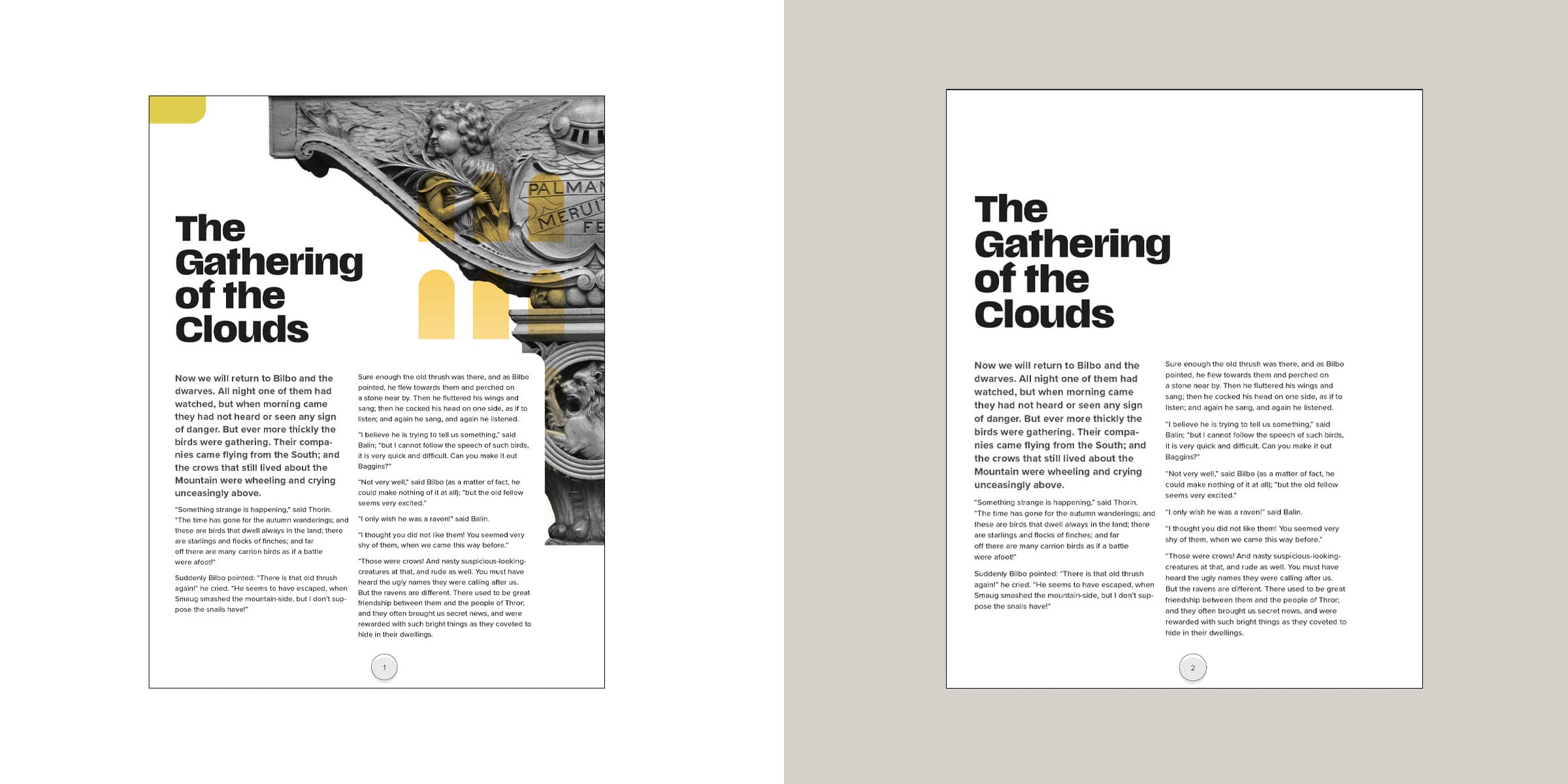
Decorative images:
These don’t need alt-text.
Purely visual (borders, spacers)
Stylistic images that don’t convey meaning
Images already explained in surrounding text
Example:
The yellow shapes are all decorative images as they convey no meaning. The page on the left does not show anything that adds to the understanding of the text. If you look at the example on the right you will see the page without the graphics and it still conveys the same message.
5. Use lists and tables the right way
When content gets complex, structure saves the day. Lists and tables turn clutter into clarity—making your message easier to scan, digest, and act on. But to work, they need to be clean, consistent, and purposeful.
Use bullet or numbered lists for easy reading.
Tables should be simple, labeled, and never include empty cells.
Add a caption or description if needed for clarity.
6. Reduce cognitive load.
People don’t read—they scan. If your content feels overwhelming, most users will bounce before they ever get to the good stuff. Your job? Make it easy to process, easy to follow, and easy to act on. Make your content scannable.
Break up long text blocks.
Use consistent layout and familiar language.
Think “easy to read, easy to act on.”
Why this matters
Accessible content isn’t just ethical—it’s strategic. Alt-text empowers users with visual impairments and improves SEO by helping search engines understand your visuals. When you write with accessibility in mind, you make your message stronger, your brand more inclusive, and your content more effective.
Check out this post for more tips on what matters most for SEO in 2025.
Accessibility isn’t a checkbox. It’s part of how we communicate—clearly, confidently, and with purpose.
Natasha Stewart is one of Accurate’s most accomplished designers. She has been captivating clients for nearly twenty years with her innovative and impactful visual work. Beyond her design career, she is the proud author and illustrator of two books—Good 2 Know: A Guide to Grammar and Today. A COVID Guide—as well as co-author of The Accessibility Guide.
Passionate about clarity and accessibility, Natasha is continually expanding her expertise in grammar and AODA, believing that clear communication lies at the heart of exceptional design. She has enriched her practice through numerous accessibility and design conferences and by completing the Accessibility Competence course at Carleton University’s Accessibility Institute.